home
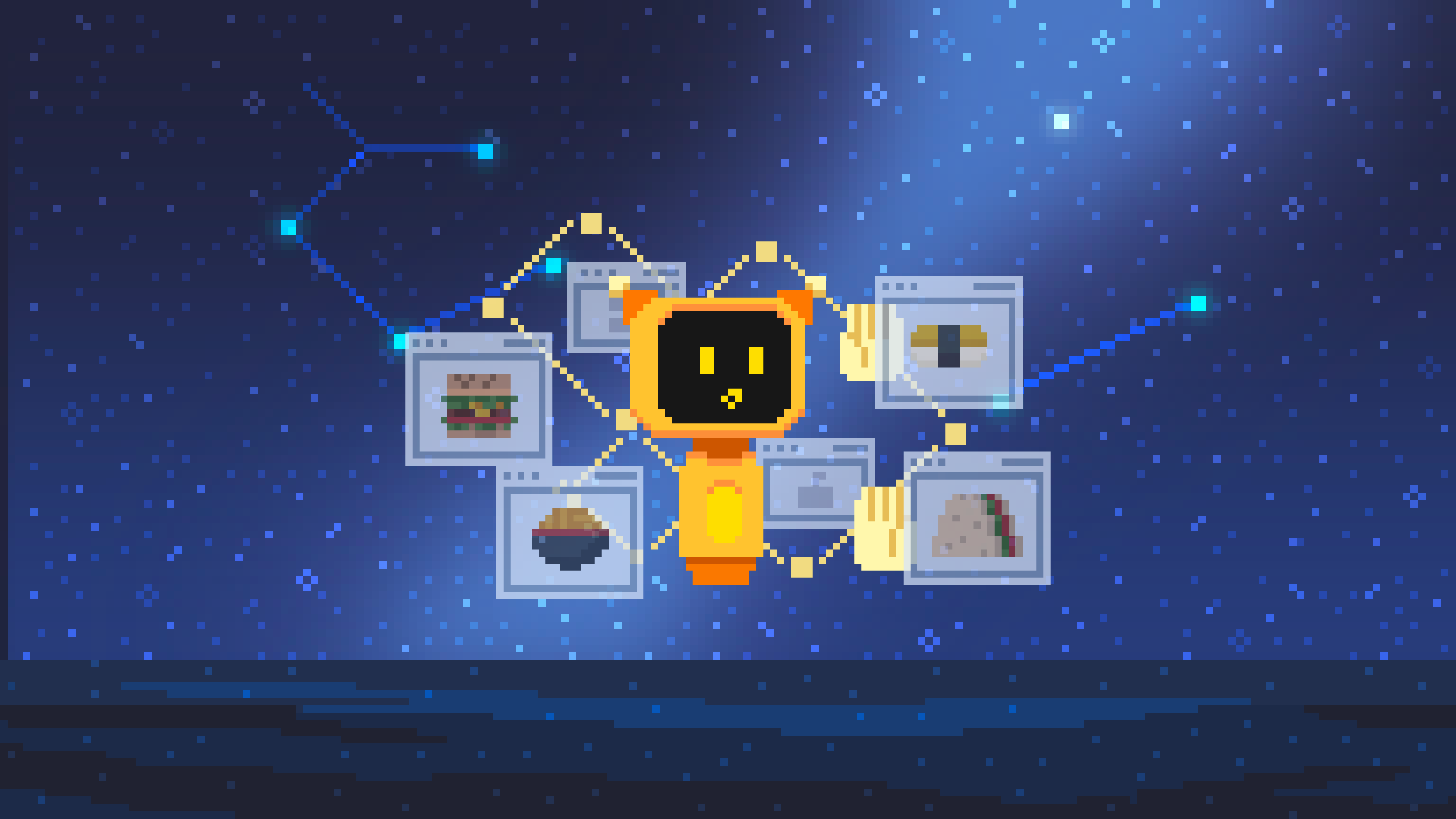
How i designed a non-traditional, playful home screen that still makes decision-making simple

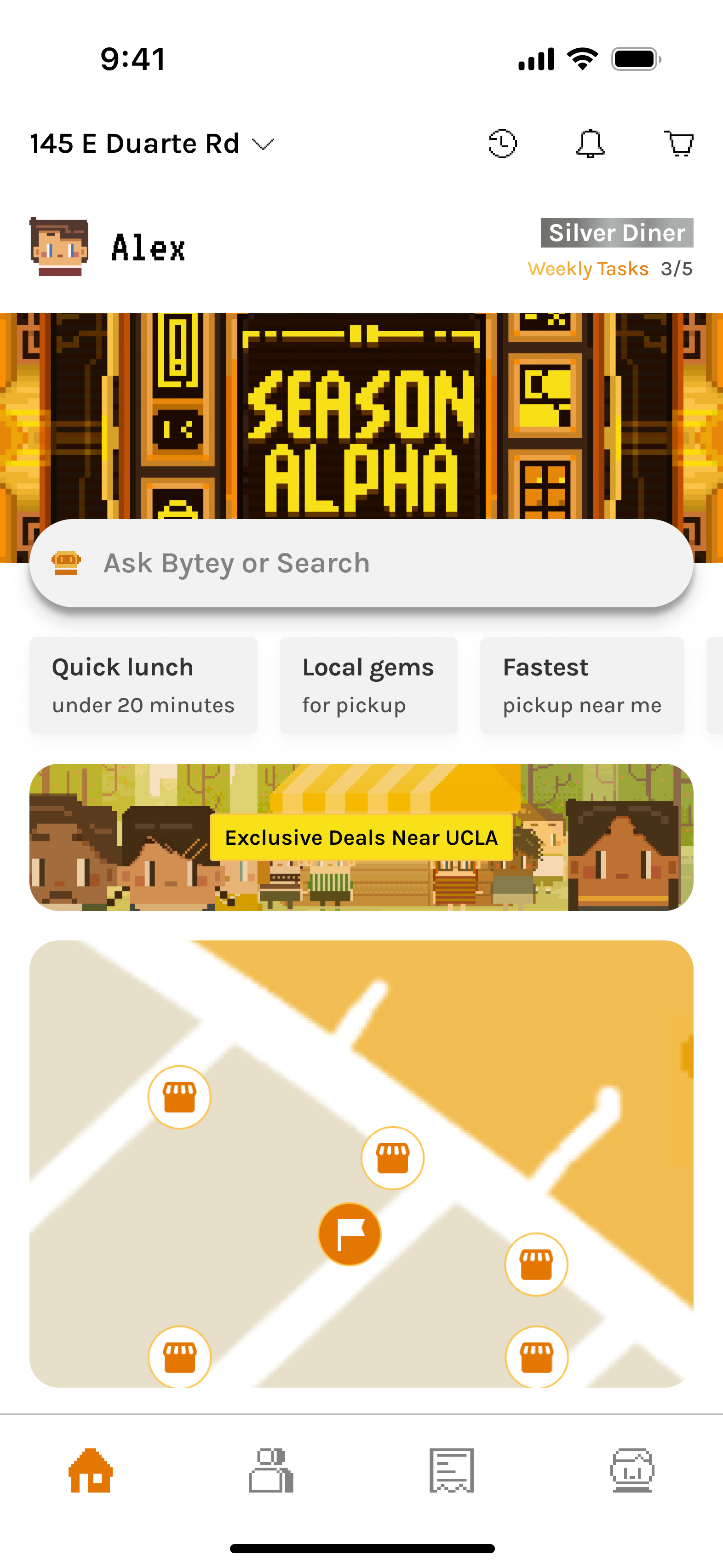
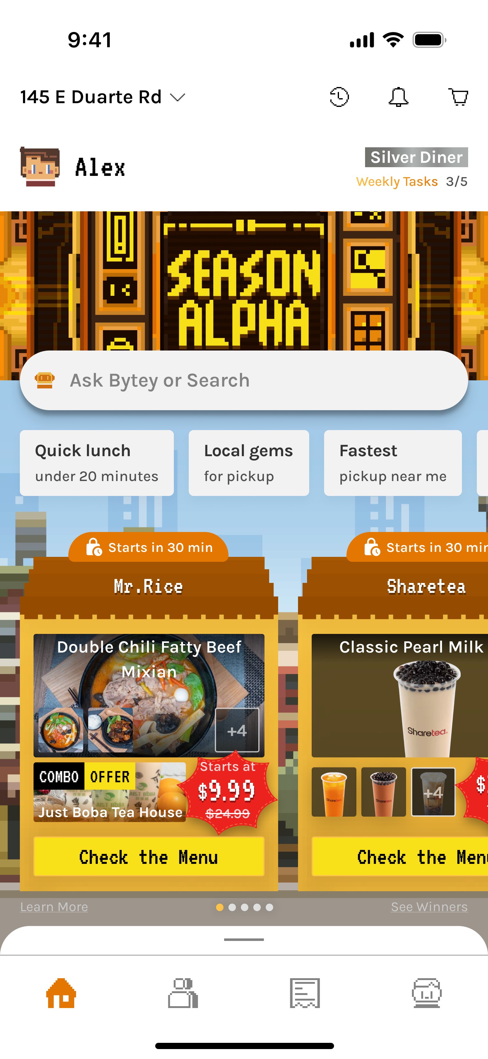
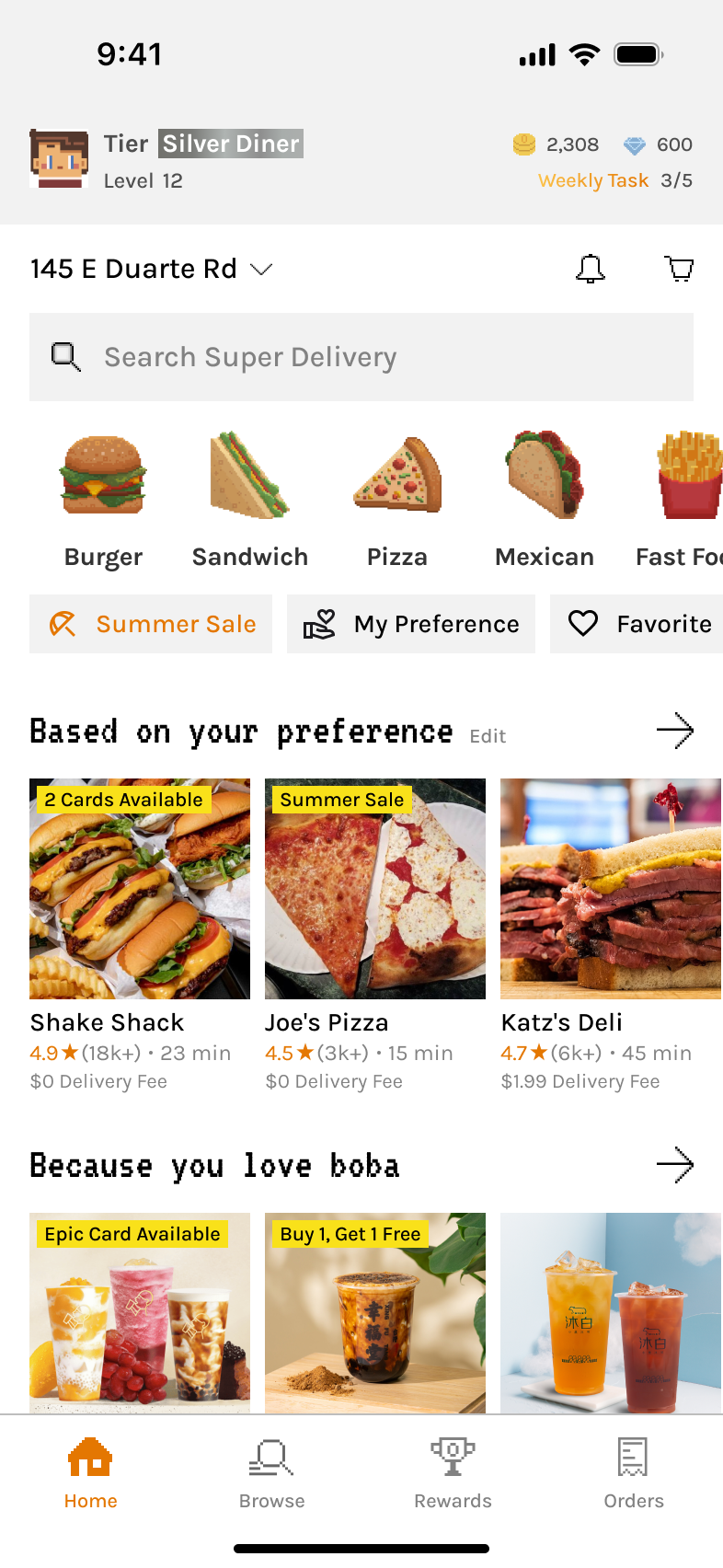
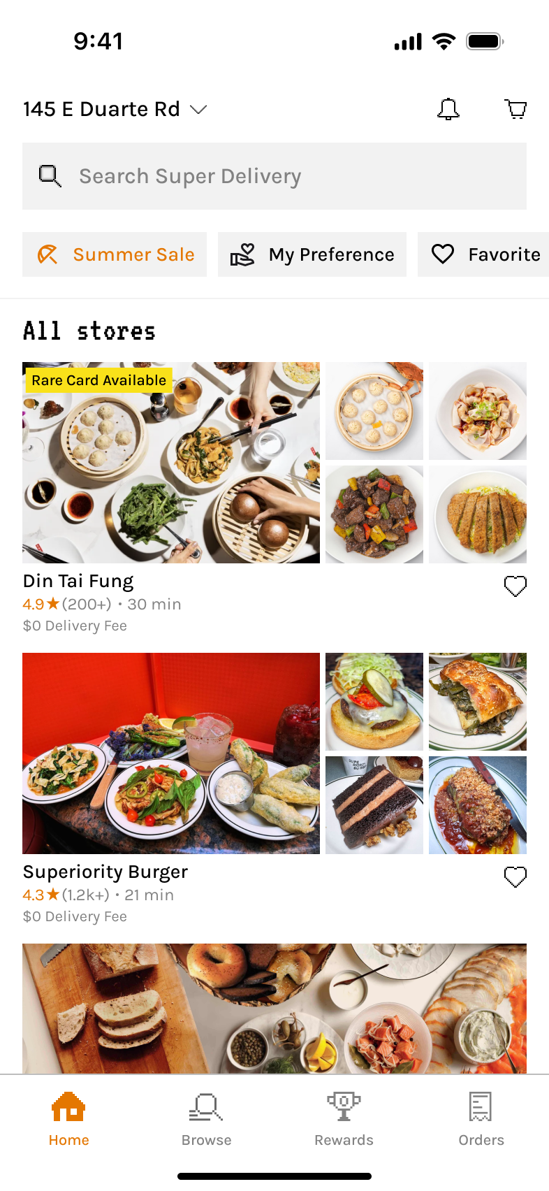
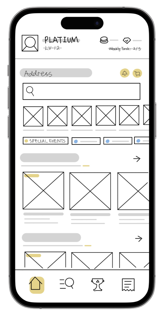
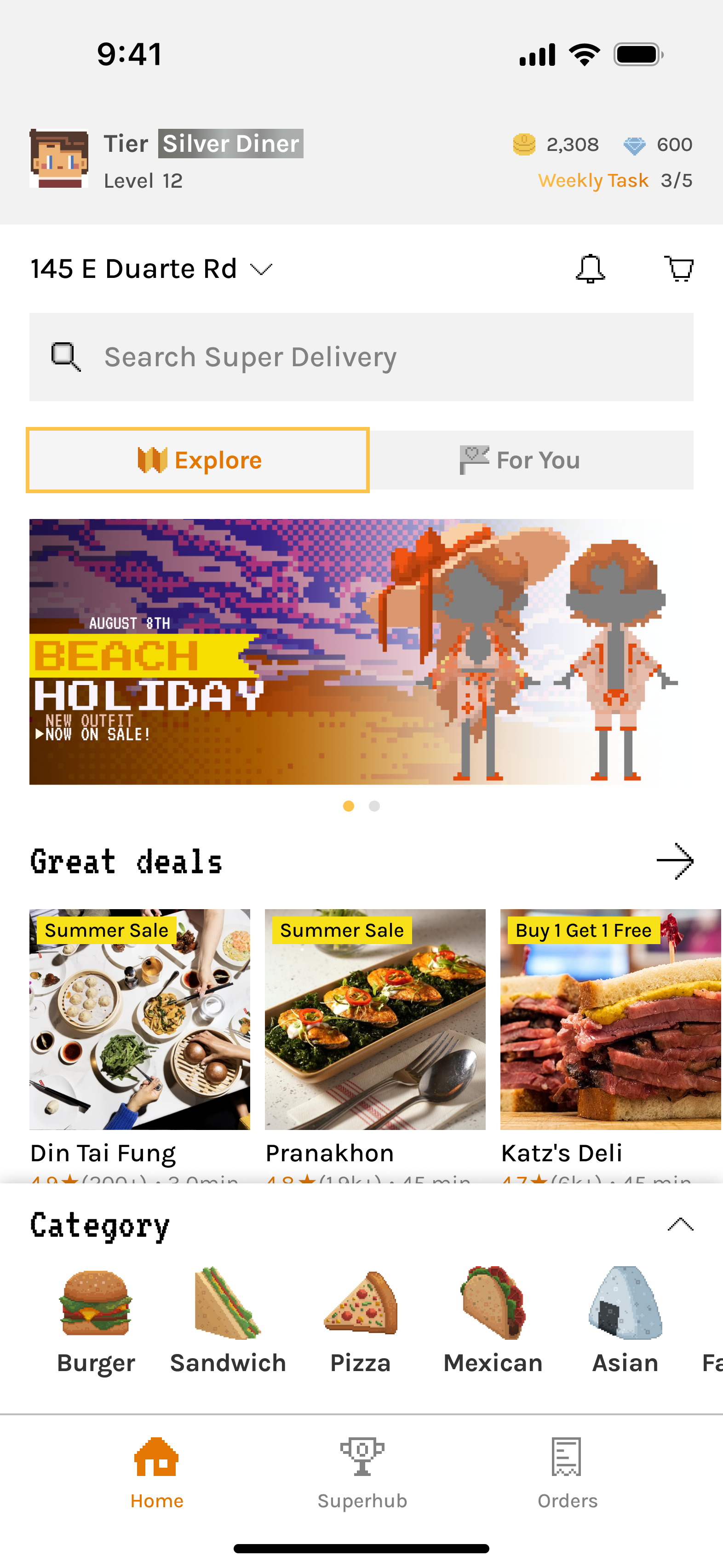
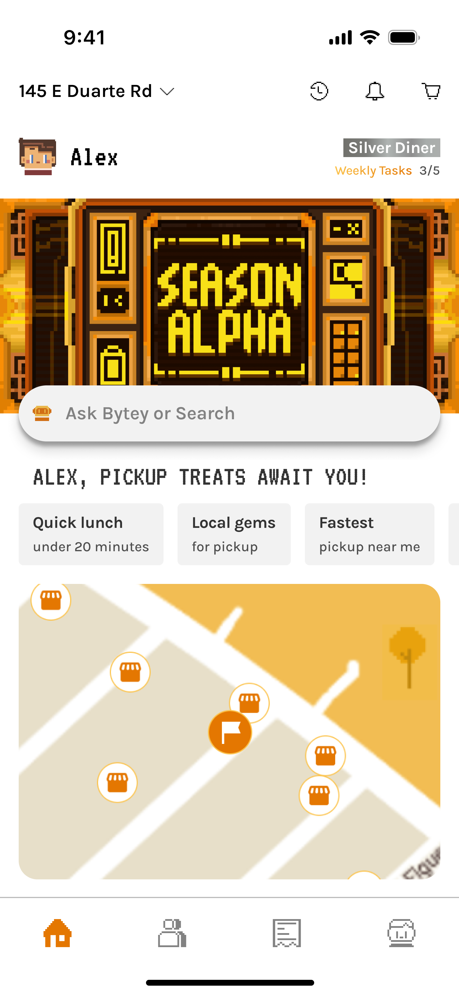
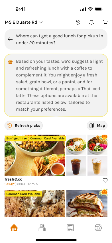
Home
Designed to support both exploration and habit-building.
The home page balances:
- Gamified content (user tiers, weekly tasks, seasonal cards)
- Smart food search (both user input and personalized prompts for new & returning users)
- Map view for pickup-first navigation
- Easy and quick access to exclusive deals/lottery for the current phase of our product that supports one area.
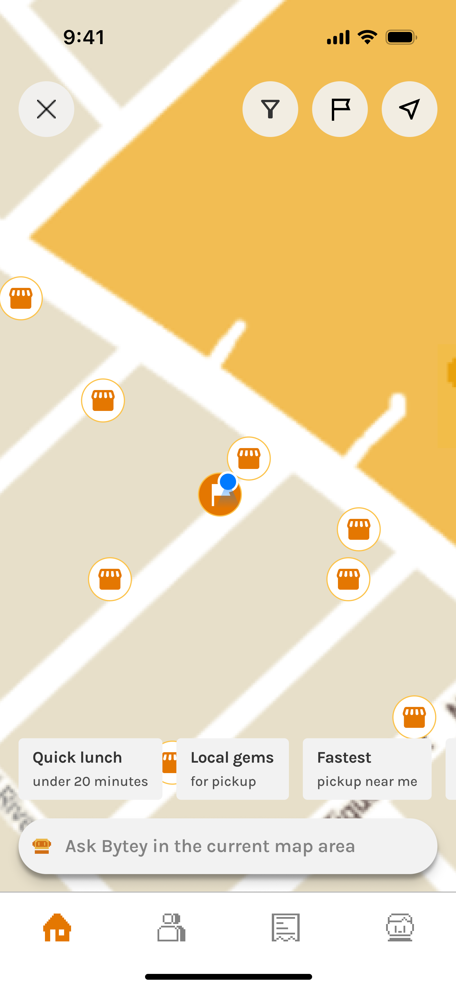
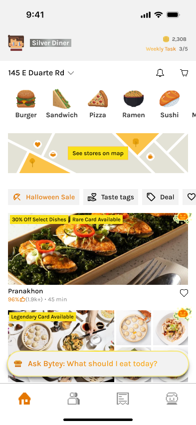
Home - Map
Built for situational navigation and decision-making.
The map view emphasizes:
- Pickup-first flow: Visual orientation around the user’s location or specified location, showing nearby restaurants with clear iconography.
- Layered filtering: Options to surface all restaurants, taste-tag matches, or saved favorites, plus real-time states like open now.
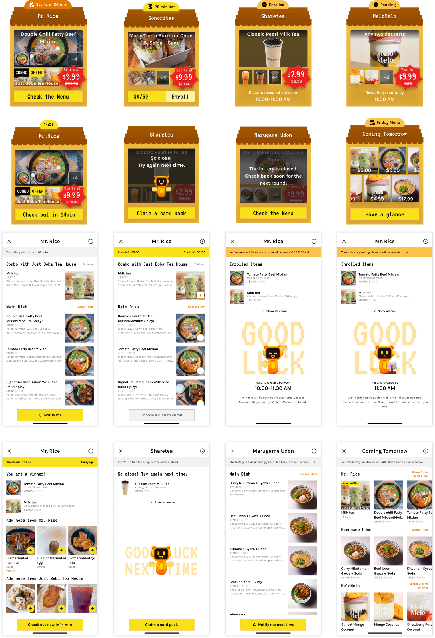
Home - Lottery
The overall visual reflects Bytey’s tone while maintaining functional clarity.
The individual house is designed for delight and usability under time pressure.
1/3
Collaborated with pixel artists to create branded lottery visuals that feel playful, Gen Z-friendly, and emotionally sticky.
2/3
Introduced a dark/night theme with full visual consistency—ensuring pixel art, text, and CTAs remain vibrant and readable.
3/3
Carefully structured the lottery display to reflect different session stages (e.g., upcoming, live, expired).
- Used distinct “house” visuals for each state
- Clear countdowns, CTAs, and winner reveal logic
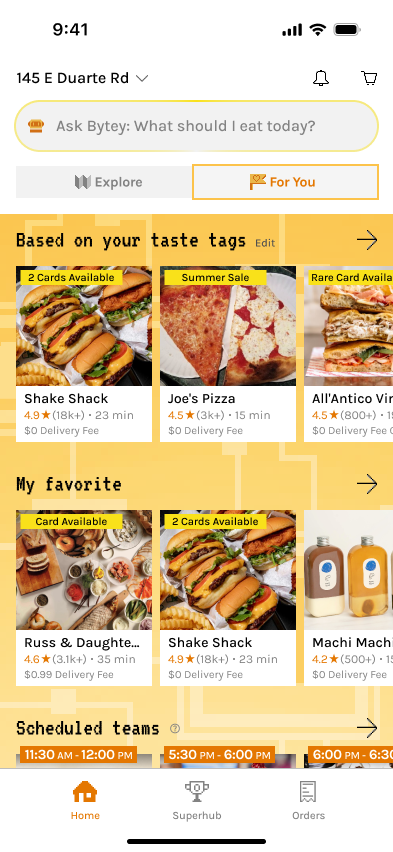
Search
Designing LLM search for real user cases — approachable, clear, and personal.
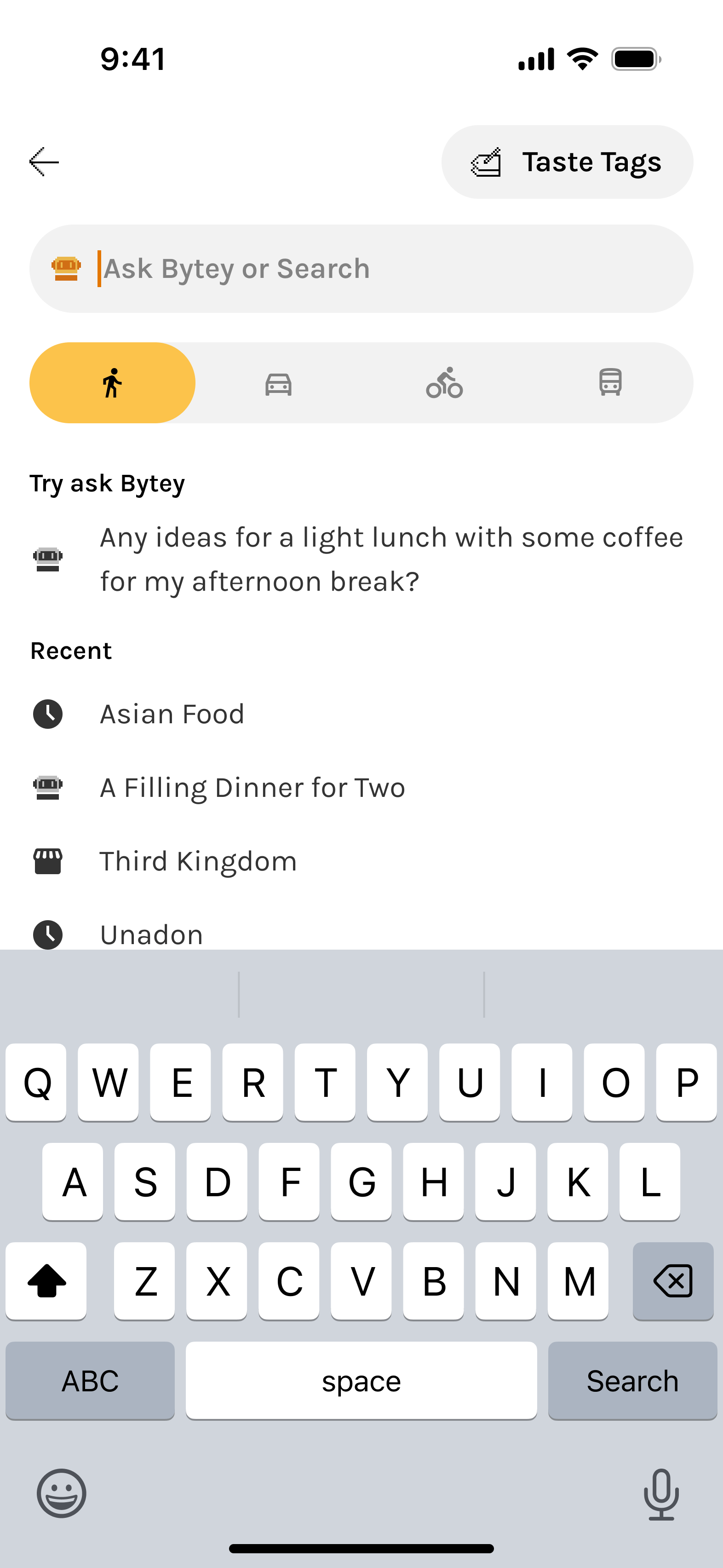
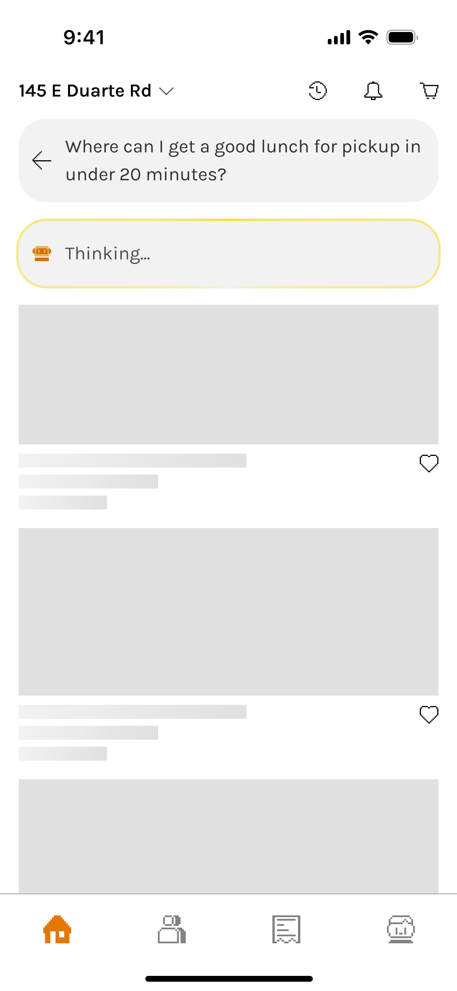

Search - Start
Built for approachability, clarity, and personalization.
The search entry screen combines:
- Natural text-based prompt input
- Visual setup as part of the prompt (Taste Tag, pickup method)
- “Try Ask Bytey” as a soft tutorial and smart prompt generator

During LLM response generation, progress feedback (a subtle and updating “Thinking…” state) manages user expectations and avoids confusion.
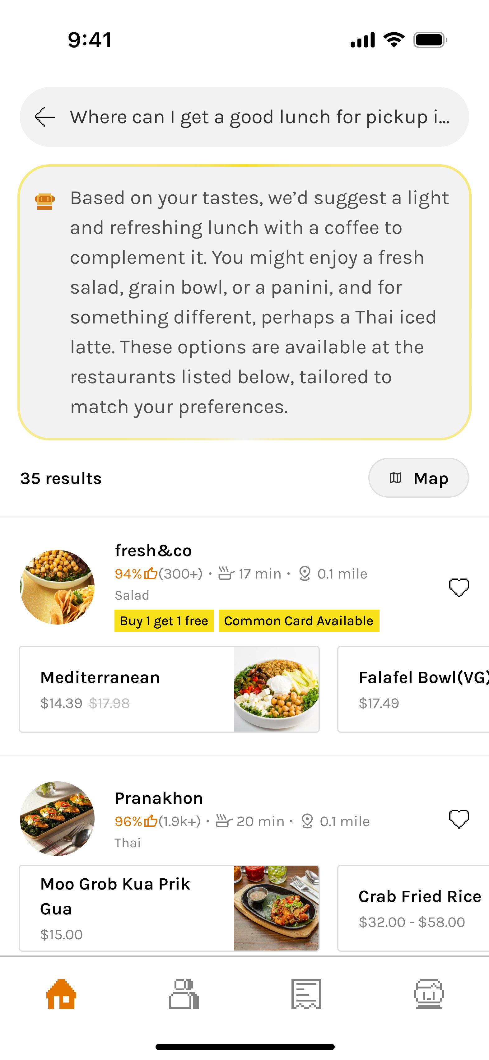
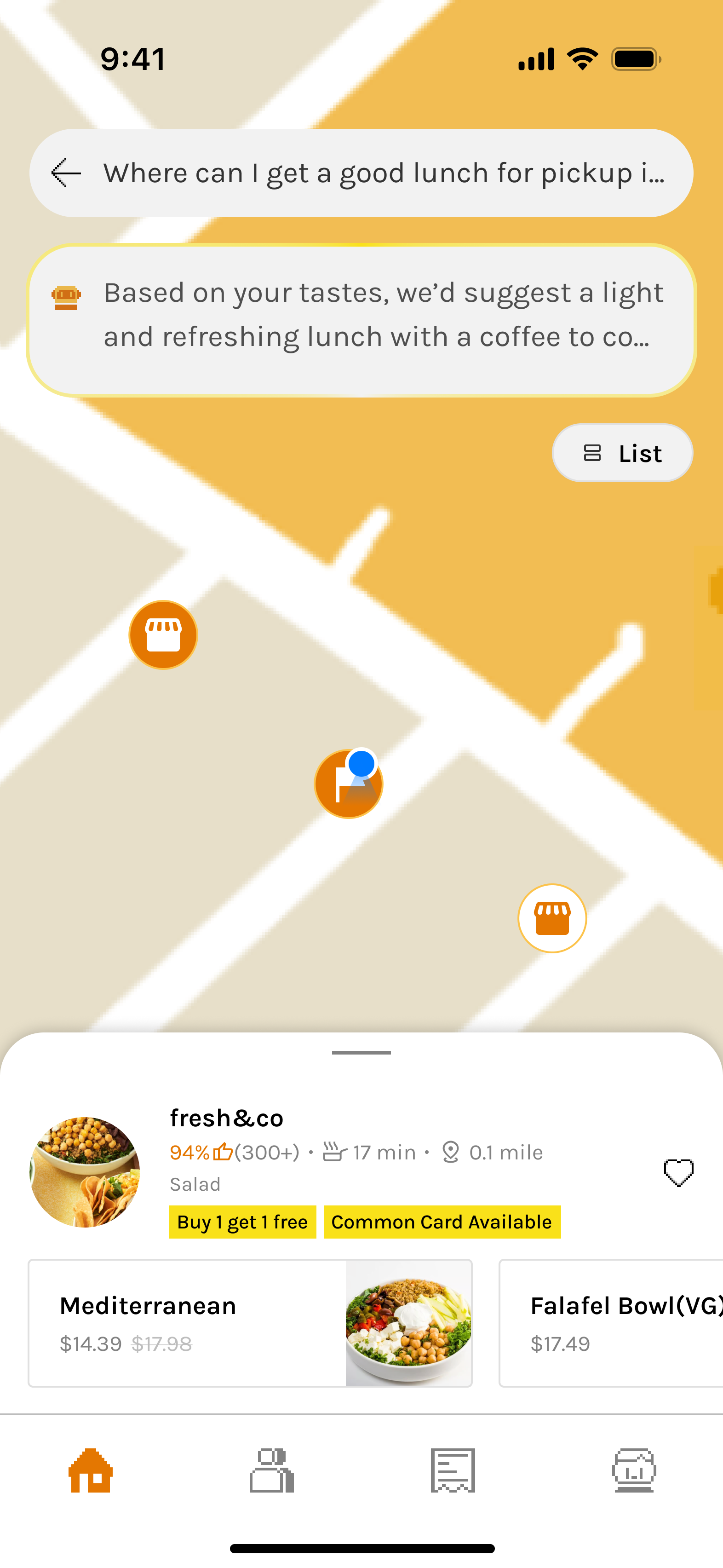
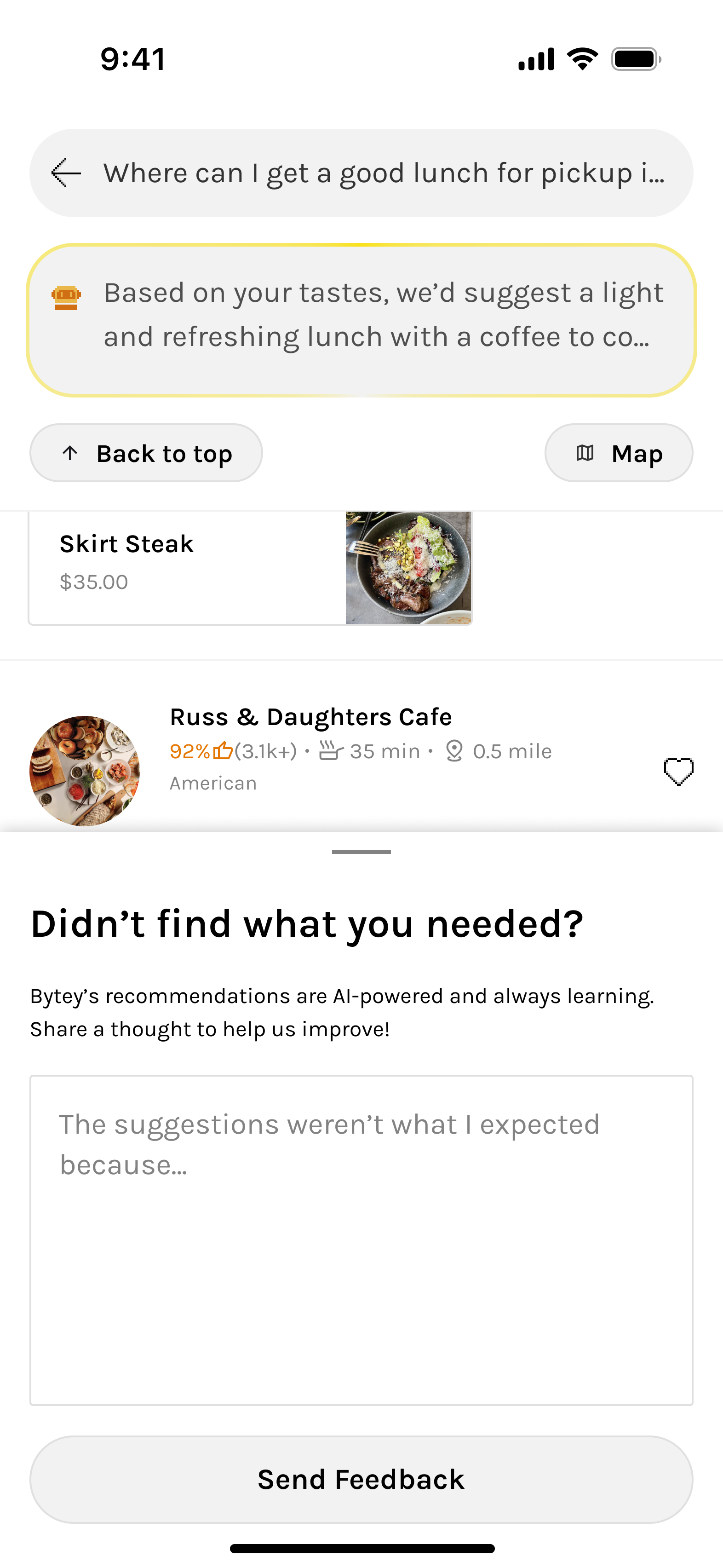
Search - Results
Smart search results prioritize clarity and decision support
Recommendation explanation, relevant restaurants, and recommended dishes, logistics, and offers in one scrollable view.
Unified Map View reinforces familiarity and eases orientation for users switching contexts.
The design reduces friction, accommodates database constraints, and helps users decide without tapping into details.
User Feedback
Why feedback works better when t’s timely, optional, and open to power users.
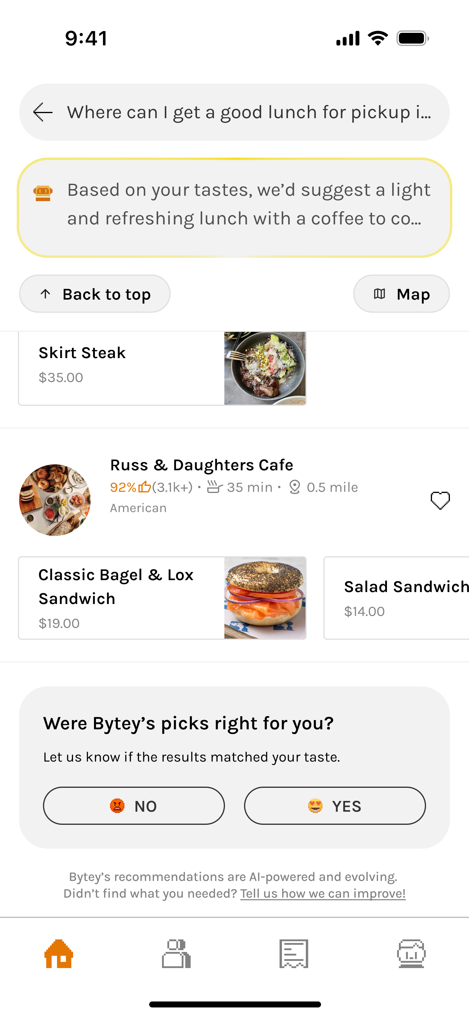
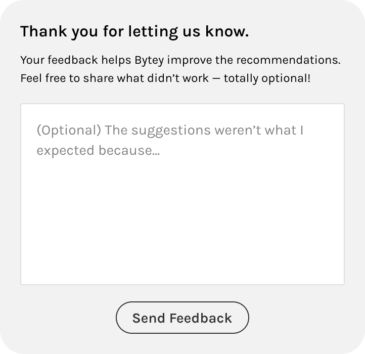

In-situ Feedback
Users were far more likely to share feedback when prompted at the right moment—not every time.
We placed this under the results, not as a modal—making it easy to notice after scrolling without interrupting the experience.
- This in-situ feedback avoids user fatigue from seeing the same restaurants.
- It appears only when behavior signals potential dissatisfaction (e.g., high search activity and low engagement).
- If the user is frustrated, we acknowledge that Bytey is still learning—and use the input to improve AI.
- If the user is just exploring, we thank them and avoid misinterpreting their curiosity as dissatisfaction.
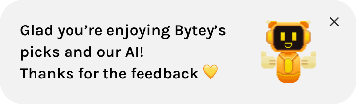
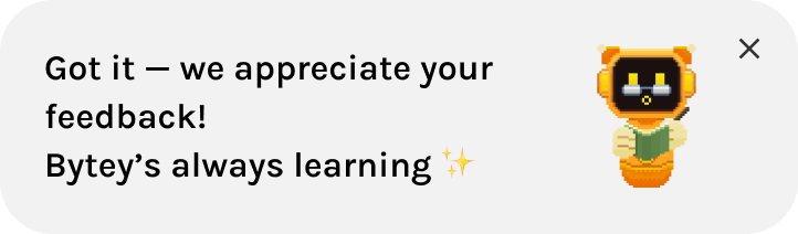
Active Feedback
Unlike in-situ prompts, this “active feedback” captures input from users who choose to speak up proactively.
It serves a different purpose:
- Lets power users or edge cases voice opinions even when not prompted
- Keeps Bytey open and responsive to unexpected issues or praise
Responsive & Accessible
Ensuring a consistent experience across screens while meeting accessibility standards.
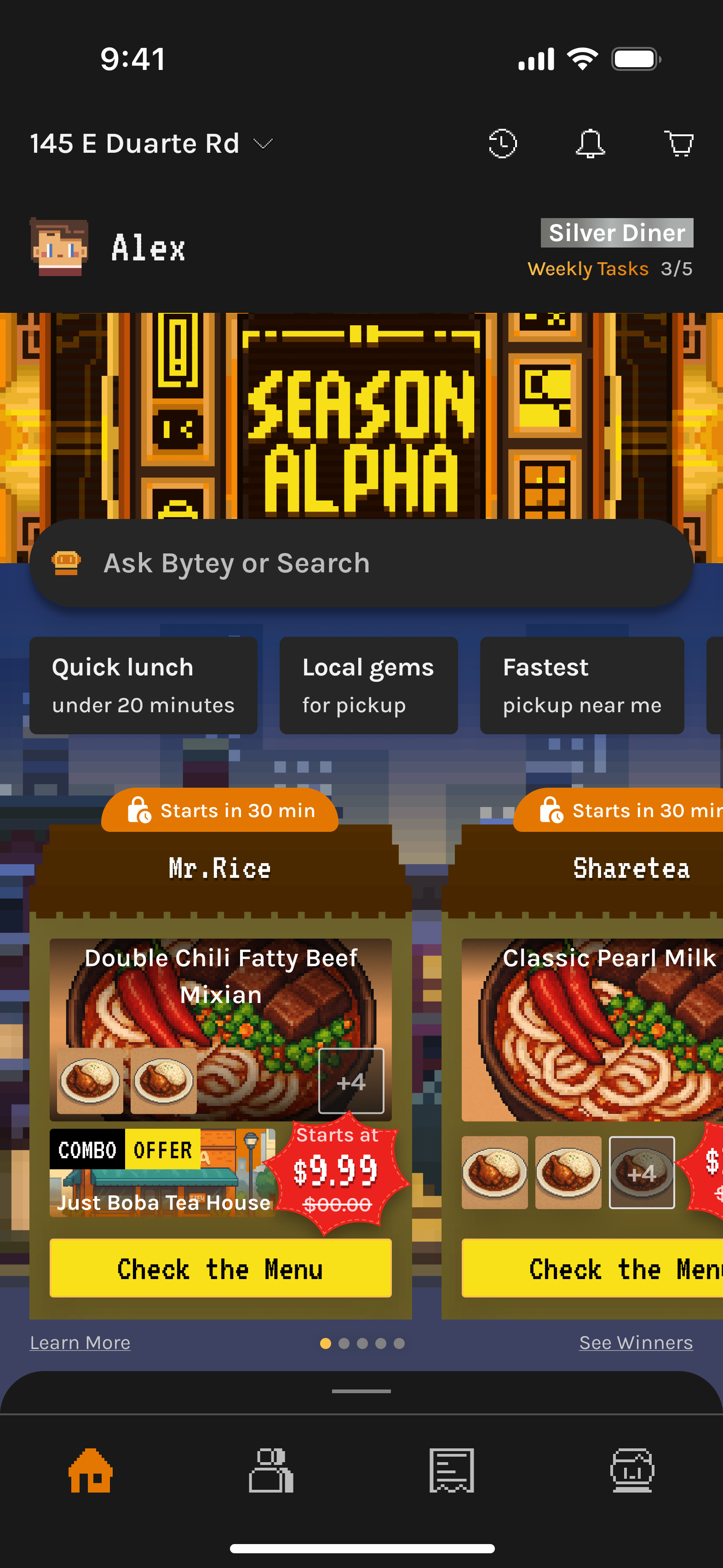
The Home Screen adapts seamlessly across screen sizes, ensuring a consistent experience among different devices.
All UI elements follow WCAG contrast standards to support visual accessibility and inclusive interaction.
HOW WE GOT HERE?
🔍 Search & Scrollable Content
Search was always the most critical entry point, but the way it was surfaced and how results were displayed evolved drastically. Early versions caused confusion (dual search modes, cluttered feeds), while later versions balanced approachability + AI adoption. Final results improved clarity, reduced friction, and drove significantly higher engagement with AI search.
Iteration 1/
Top Search Bar (Basic)
A familiar start with subtle personalization.
Introduced a basic search bar at the top with slightly smarter algorithm enhanced by Taste Tags.
✅ What Went Well
- Provided a familiar entry point, lowering the barrier for new users.
‼ What Went Wrong
- Felt like a regular search with limited personalization, even with Taste Tags. UI too similar to competitors, missing uniqueness.
➡️
Led to dual-tab experiment to highlight personalization.
- Top category section flow mismatch: users skipped it at first and only returned after exploring
➡️
Rethink category placement to bottom for quick navigation that better matches user behavior.
Iteration 2/
Two Tabs, Split Search Modes
Introduced brand identity and separated exploration from personalization.
Split the Home into two tabs:
- Explore: browsing and brand expression
- For You: a curated mix of content powered by AI, Taste Tags, and user-managed features
- Added AI search mode and distinct background in “For You” tab to reinforce its smart, customized role.
Moved Category section to the bottom; expandable and collapsible while browsing, making navigation easier without taking too much space.
✅ What Went Well
- Allowed AI search to be visually distinct, and redesigned the 'For You' tab to make personalization feel more meaningful and helpful.
‼ What Went Wrong
- Dual tabs confused users and fragmented experience.
➡️
Consolidated into one search bar to reduce mental load.
- Category vs. Search imbalance: User testing showed that while the redesigned category section was more accessible, it was still a lower-frequency action compared to search. Users consistently preferred search, and having two separate search modes across tabs added confusion.
➡️
Move search to bottom for thumb access and reposition categories to top for better alignment with user scanning behavior.
Iteration 3/
Bottom Unified Search with Simpler Layout
Streamlined experience with improved accessibility.
Removed dual tabs, merged AI + traditional search into one bar at the bottom for thumb-accessibility.
Moved search to bottom for thumb access; shrinks into floating button while scrolling for quick access.
Suggested prompts appear with a subtle highlight animation on the repositioned bottom search bar to encourage AI usage.
Removed horizontal content sections and replaced them with chip-based filters for high-use categories like Deals and Taste Tags, creating a cleaner vertical layout.
✅ What Went Well
- More thumb-friendly with search at bottom of screen.
- Combined AI + traditional search in one view felt lighter and easier to act on, with clearer visual hierarchy.
- User testing showed better understanding of core features and less friction, as highlighted search bar with suggested prompts guided actions.
- Chip filters for a streamlined vertical feed simplified exploration and improved discoverability without overwhelming users.
‼ What Went Wrong
- Lacked uniqueness and excitement: While the experience was user-friendly and simpler than competitors, both user feedback and internal review found it too safe and forgettable.
- Still too much reliance on scrolling content, and thus AI adoption lagged: Many users continued doom-scrolling the feed instead of using AI, largely because they were unfamiliar with its output or skeptical of its effectiveness.
➡️
Total redesign to highlight AI upfront and remove the feed entirely.
Iteration 4/
Centered AI-First Redesign
AI becomes the centerpiece of the experience.
Redesign emphasized AI with central search bar for the Home screen.
Quick prompt examples that offered contextual, time-and-behavior-based suggestions.
Warm greetings that made the experience feel more personal and human—especially helpful for AI-first products.
Transparency in recommendations with Bytey clearly explains why each match is shown—based on time, taste, and pickup preferences in the search results.
✅ What Went Well
- Total redesign of the home page made the experience more branded and AI-first.
- Central placement emphasized AI while still positioned within the thumb coverage zone, keeping it easy to access with one hand.
- Quick AI prompt suggestions made intent clearer and easier to use—helping users understand and interact naturally with AI through contextual, time-based prompts.
- For the search results, clear “Why these results” messaging differentiated Bytey from generic food apps and builds trust and reduces friction for first-time users.
‼ What Went Wrong
- Refresh model* for search results broke expectations: Users wanted seamless scrolling, not manual refresh.
➡️
Upgrade algorithm for continuous, ranked results (Scroll model*) and removed “Refresh Picks”.
- User feedback indicated that banner images for restaurants added little value, and partner data gaps with limited dish imagery caused frictions in decision-making.
➡️
Final redesign of search results with smaller-banner, info-rich restaurant cards that help decision-making and new dish layout working well even without images.
Final/
Search Results Redesign
Smarter presentation of restaurants and dishes.
Algorithm improved to update results dynamically while scrolling. Results show richer info (prep time, cuisine, dishes inline).
✅ What Went Well
- Compact cards highlight prep time, distance, and cuisine—critical data for pickup users.
- Inline dishes layout is universally usable even without dish photos.
- Clearer hierarchy with rich restaurant and dish info reduced taps needed to decide, creating a frictionless path to ordering.
Outcome & Impact
30–40% uplift
AI search adoption over time
Though initially unfamiliar, smart prompts and simplified UI nudged AI search usage upward. We also observed a shift from passive doom-scrolling to active discovery through AI, especially among Gen Z users.
25–35% increase
First-order conversion (users trying AI search + ordering vs. passive browsing)
Internal and user feedback showed the redesign improved clarity and usability, while maintaining a clean, engaging interface.
Higher perceived transparency and trust
From “Why these matches” explanations.
🎨 BANNER
The banner’s role evolved significantly—from a brand anchor to being removed for clarity, then returning as a core entry point to gamification and brand storytelling. Its journey reflects our effort to balance visual identity, function, and user focus. Ultimately, the reintroduced banner reinforced Bytey’s playful tone and created a direct path to engagement with seasonal content and rewards.
Iteration 1/
No Banner
A clean but generic starting point.
Focused on minimizing distractions and validating core food discovery flows first.
✅ What Went Well
- Simple layout helped test the base experience without visual noise.
‼ What Went Wrong
- UI lacked distinctiveness and Bytey’s character wasn’t visible.
➡️
Needed a brand-driven focal point.
Iteration 2/
Pixel-Style Banner Added
Bytey gains a visual voice.
Introduced pixel-art banner to showcase restaurant discoveries, gamified events, collaborations, and seasonal campaigns.
✅ What Went Well
- Added strong personality through pixel-art illustrations aligned with Bytey’s identity.
- Served as a soft entry point into gamification without disrupting flow.
‼ What Went Wrong
- Banner visuals drew attention but had low click-through for actual restaurant discovery.
➡️
Re-evaluate the content, necessity, placement and space usage.
Iteration 3/
Banner Removed
Prioritized clarity and feed performance, optimized for pickup platforms.
Removed banner to make space for the map view entrance (essential for pickup) and show more restaurants, declutter the screen, and optimize scrolling speed.
✅ What Went Well
- Cleaner UI improved usability and information density.
‼ What Went Wrong
- Loss of brand expression and missed opportunity to connect users to events and gamification.
➡️
Needed a brand-driven focal point.
Iteration 4/
Banner Brought Back
Brand and clarity in harmony while clearing up the feed.
Reintroduced banner as a dual-purpose entry point—both a visual brand anchor and interactive portal to Bytey’s gamified features.
✅ What Went Well
- Reinforced Bytey’s Gen Z–friendly, playful identity.
- Served as dynamic in-app billboard for ongoing campaigns.
- Balanced clarity and expressiveness with optimized height and scroll behavior.
🌟 Future guidelines
- Needed ongoing asset refreshes to avoid banner fatigue and maintain relevance.
➡️
Established internal artist collaboration loop for timely updates.
Outcome & Impact
25–30% Increase
Engagement with gamified systems
Avatar setup completion rate +30%. Card system entry +25%.
Improved brand recall and recognition
Among Gen Z users during usability studies.
Enhanced visual differentiation
Versus major food apps, making Bytey feel more like a “game-world” than a utility app.
Reusable banner system
Allowed fast asset swaps for new collaborations and events.
🕹️ Gamification Snippet
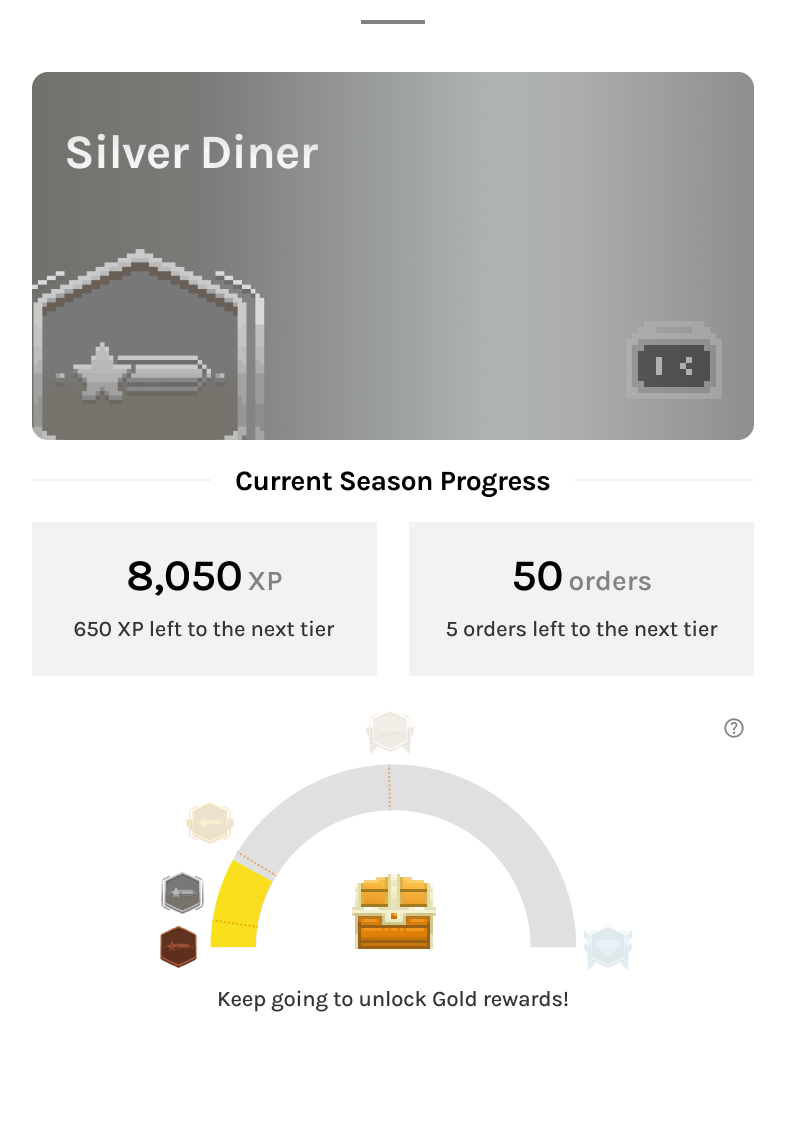
Gamification has always been a pillar of Bytey’s identity. The gamification snippet at the top of the home screen evolved alongside Bytey’s entire reward system. Early designs emphasized deep RPG-style progression and multiple in-game currencies; later versions simplified into a clean, tier-based model aligned with the pickup-only business focus.
The snippet’s goal remained consistent throughout: to motivate loyalty, highlight progress, and make gamification visible but not overwhelming. Along with the banner and lottery section, it ensures all essential gamified features are easy to access, emotionally engaging, and scalable.
Iteration 1 - 2/
Full RPG-Style System
Comprehensive but complex foundation.
- ⚙️ Displayed a holistic system: avatar, tier, level, coins, points, and weekly tasks.
- 💰 Two in-game currencies: coins (for gamified features) and points (for order savings).
- 📈 Dual progression: Tier (capped, can rise or fall) and Level (XP-based, only rises, no cap) for short- and long-term motivation.
✅ What Went Well
- Weekly task indicator effectively motivated engagement.
- Avatar and pixel style received positive user feedback (“cute” and personal).
- System depth encouraged curiosity and exploration.
‼ What Went Wrong
- Too many layers (Tier vs. Level, Coins vs. Points) created cognitive overload.
- Visually crowded, distracted from core actions.
- Broader usability testing confirmed while engagement was steady, users found levels and multiple currencies confusing and didn’t grasp their value.
➡️
Set direction to simplify into a single-tier model.
Iteration 3/
Tier-Centric Simplification
Business pivot + user feedback → leaner gamification system.
- Bytey pivoted from delivery → pickup-only; system simplified for sustainability
- Removed Levels and Points; kept Avatar, Coins, and Weekly Tasks.
- Integrated XP into Tier progression—inspired by airline/hotel loyalty models.
- Tiers became seasonal milestones with different benefits and rewards per level.
✅ What Went Well
- Tier-based design aligned with business model and user expectations.
- Simpler system reduced confusion while retaining a sense of progression.
- Weekly tasks remained effective motivators.
‼ What Went Wrong
- Coins felt redundant—unlike Points as direct incentives, Coins had limited uses and low impact on motivating orders or app engagement.
Iteration 4 - Final Version/
Minimal Snippet for Focus
Personalized, lightweight, and growth-aligned.

- Removed Coins to reduce redundancy; shifted growth focus to AI Search and Order Conversion.
- Snippet now shows Avatar, Name, Tier, and Weekly Tasks only.
- Other currencies (like Shards for Cards) moved to relevant tabs for contextual clarity.
✅ What Went Well
- Clean, personal, and approachable—users felt it was “motivating but not gamey.”
- Balanced layout with added user name humanized the interface.
- Integrated seamlessly with Banner below (event/card system entry).
Expanded gamification now distributed across three key entry points:
- Snippet: daily and weekly progress tracker.
- Banner: seasonal events and card system gateway.
- Lottery Section: real reward driver tied to orders.
Together, they form a cohesive and accessible gamification ecosystem, keeping motivation visible but never intrusive.
Outcome & Impact
~ 50% of weekly task entries
came from the Home Screen snippet
Confirming strong engagement and its potential to further boost completion.
Improved clarity and comprehension
Of reward mechanics.
Expected higher retention
Core gamification engagement indicates it helps drive repeat usage from completing weekly tasks, collecting seasonal cards, to tiering up and earning achievements.
Brand alignment
Gamification remained fun, light, and credible—reinforcing Bytey’s playful yet practical identity.


