
HOW WE GOT HERE?
🤳 Onboarding flows user testings
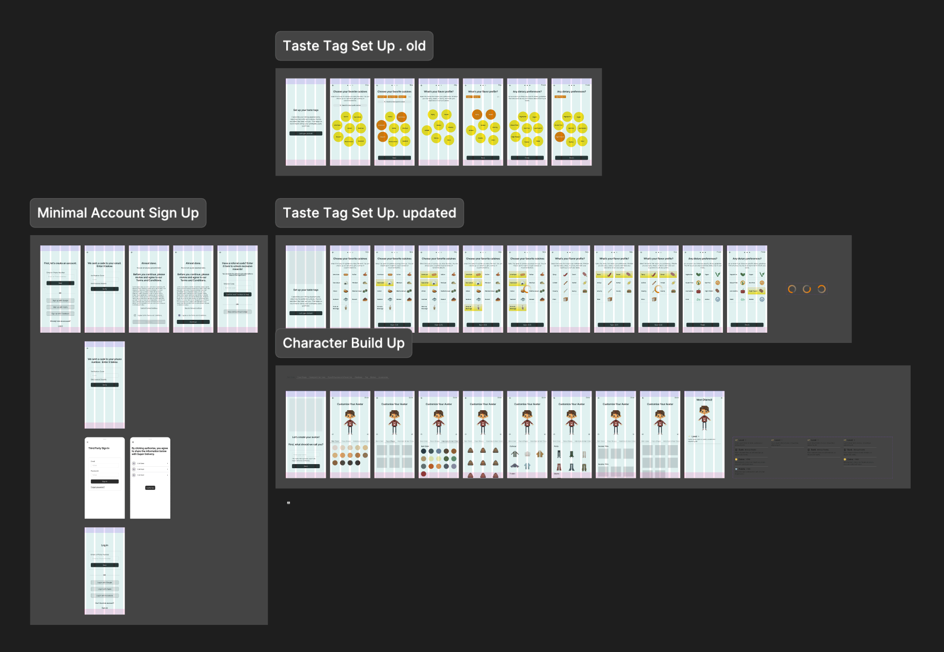
I began by modeling each setup independently (Account, Taste Tags, Avatar, Location, Gamification guidance), then recomposed them into end‑to‑end flows.
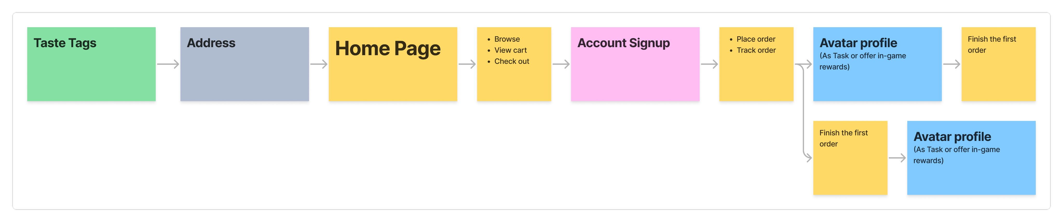
Flow 1/ All-Upfront (Baseline)
Complete setup required before reaching the home page.

✅ What Went Well
- Consistent initial dataset; fewer interruptions later.
- Few people who love customization enjoyed avatar up front.
- Clear sense of Bytey’s scope and features.
- Valuable as a control.
‼ What Went Wrong
- Long time‑to‑home; fatigue; drop‑offs during Avatar.
- Perceived as "too much before trying anything."
📊 Indicative metrics
Median time to Home
2m05s
Flow completion
54%
“Too long” feedback
~75%
(n≈26)
Flow 2/ Defer Avatar
Shorten onboarding by defering non‑critical steps while keeping strong recommendations.
✅ What Went Well
- Shorter flow; perceived “lighter” onboarding; better focus on recommendations.
- Avatar completion improved when framed as a reward.
‼ What Went Wrong
- Still felt long to some users.
- Account upfront still created early abandonment.
📊 Indicative metrics
Median time to Home
1m22s
Flow completion
68%
(n≈28)
Flow 3/ Taste-First
Enable a progressive account setup to allow users to access the app sooner.
✅ What Went Well
- Strong early relevance; better first‑session engagement.
‼ What Went Wrong
- A subset was unsure what to pick; wanted a skip.
📊 Indicative metrics
Median time to Home
0m52s
Flow completion
82%
(n≈32)
Flow 4/ Progressive Disclosure
Push friction as late as possible. Introduce setup only when a feature requires it.
- All skippable initially; surface steps contextually (banners, overlays, first‑touch triggers).
- Account at checkout / save / deeper actions; Avatar via tasks/rewards; Taste Tags initially skippable.
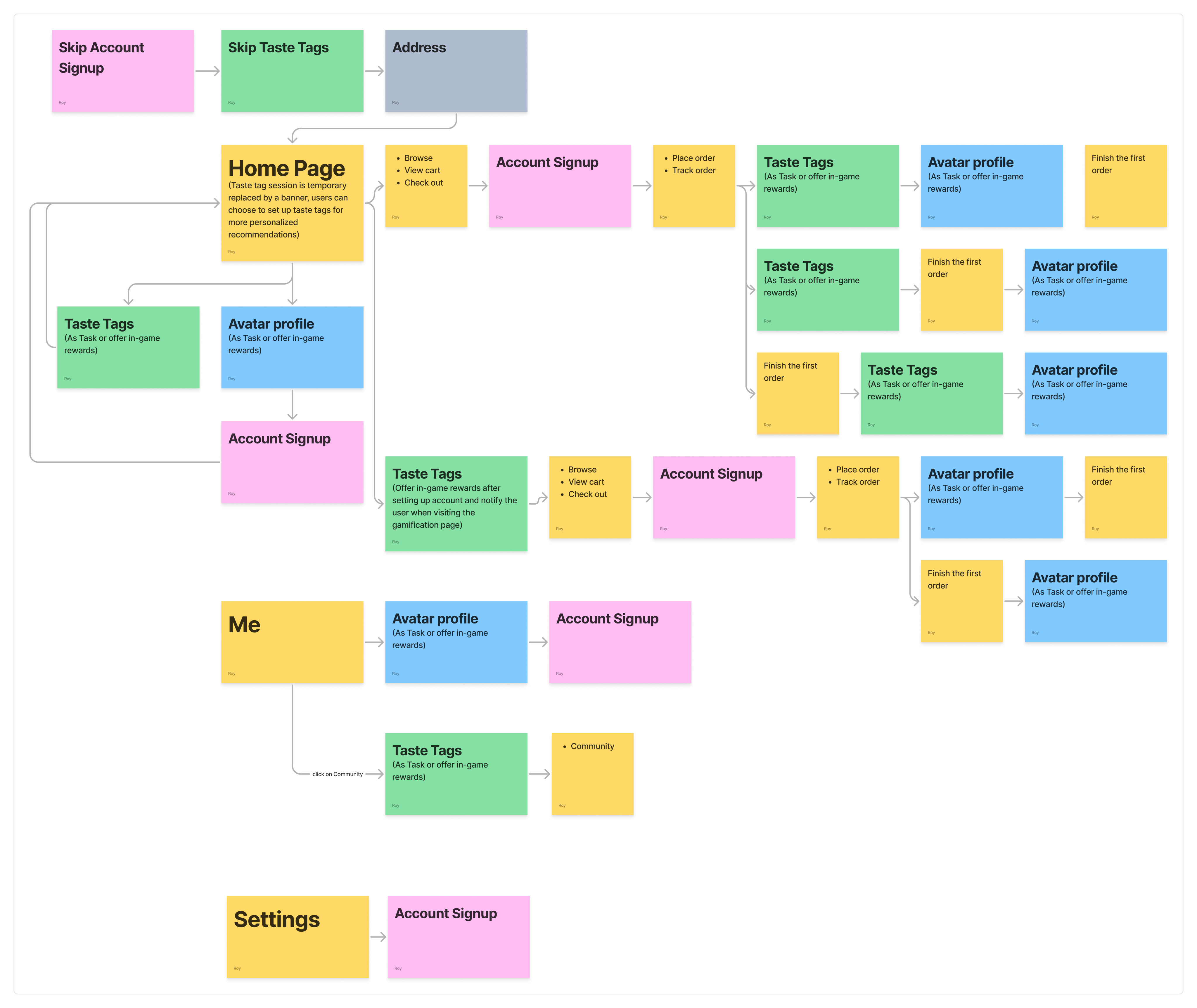
✅ What Went Well
- Shortest path to value; very strong preference in testing for overall simplicity.
‼ What Went Wrong
- Taste Tag prompts were missed or treated like ads
- Some users later felt the app lacked “personality” without early tags. Initial recs lost some sparkle.
📊 Indicative metrics
Median time to Home
0m34s
First-session activation into search/categories
+21–27%
vs Flow 2
Preference in qualitative ranking
≈68% chose Flow 4
“Banner looked like ads”
~23%
(n≈34)
User Testing Summary
General feedback (majority)
- Flow 4 preferred for brevity and clarity.
- Flow 1 felt too long; Flow 2 split opinions; Flow 3 largely acceptable.
- Avatar is more reasonable after trying the core experience; a minority loved it early.
- Some wanted Taste Tags skippable at first because they were unsure what to pick.
- People love OTP.
Specific feedback (minority)
- A subset found Avatar fun/engaging up front, but we assessed higher drop‑off risk.
- Taste Tags created choice overload at first; better once they knew the app.
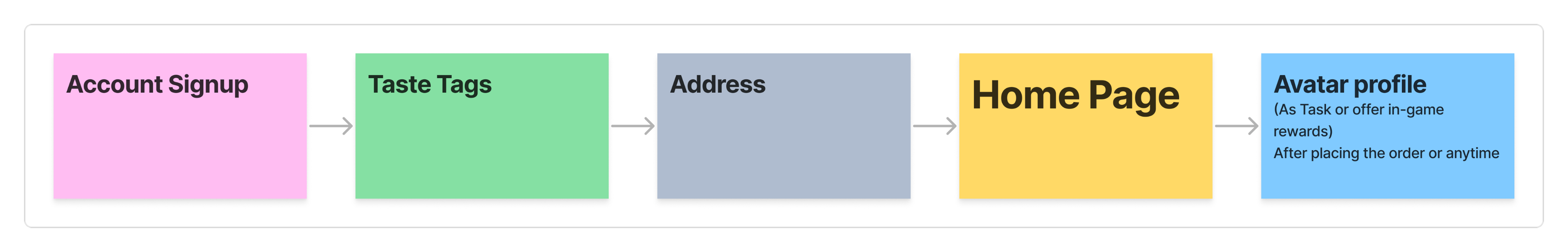
Final Flow (Best of Flow 3 + Flow 4)
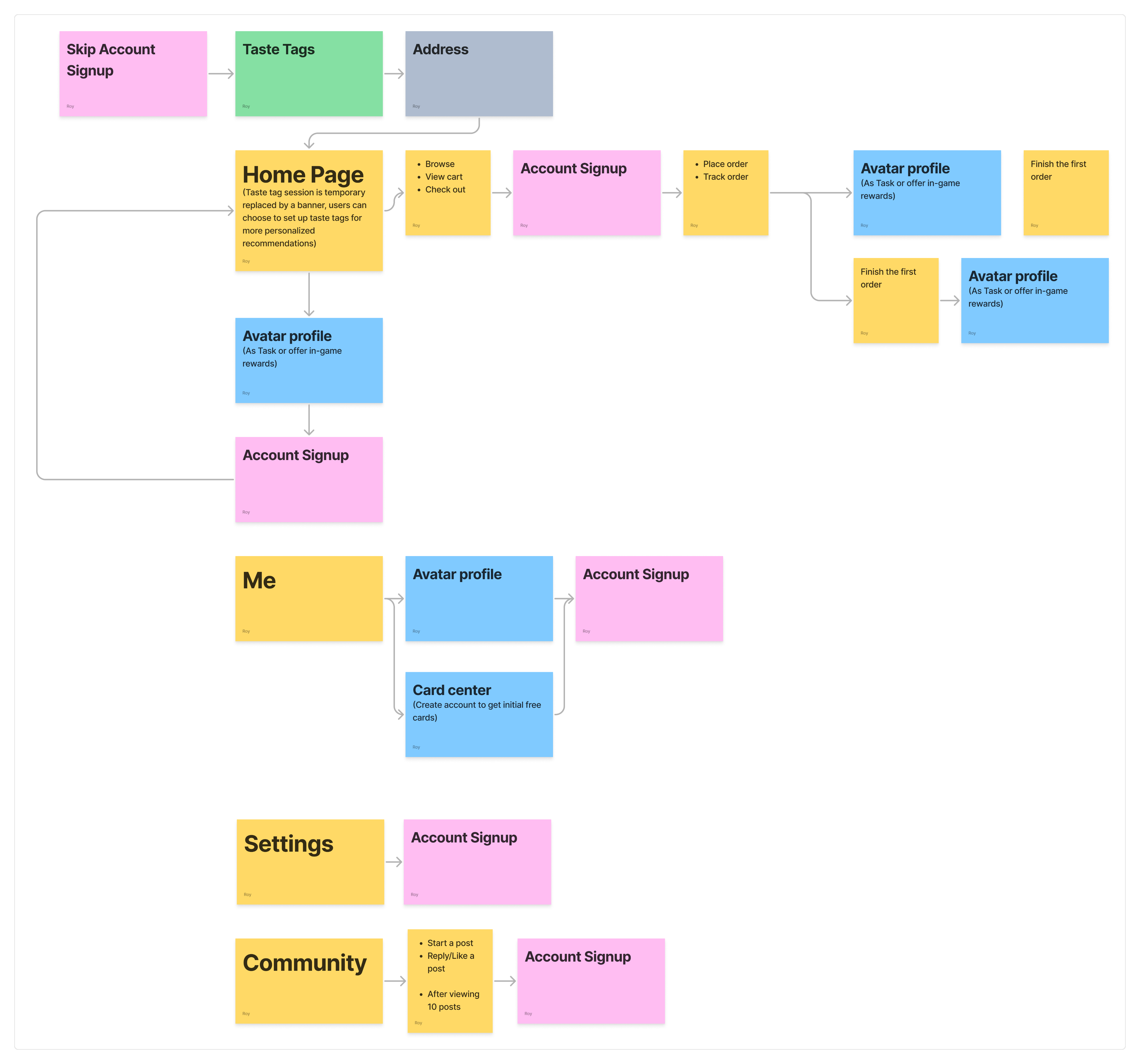
Decisions
- Keep progressive account and progressive avatar from Flow 4.
- Keep OTP (No passwords) for account sign-up.
- Make Taste Tags mandatory—shortened and clarified—to lift recommendation quality and session satisfaction from day 0.
- Location stays at first Main entry.
- Keep avatar as a quest with small rewards and multiple entry points.
Why this trade‑off works
- A small upfront step (Taste Tags) substantially improves personalization and reduces bounce from “generic” results.
- Users still get speed: 3 short screens with clear helper text and modern micro‑interactions.
- Since Taste Tag setup is non-skippable, Taste Tag UI needs to be re‑written to reduce ambiguity and indecision (updated tags* that better reflect the user needs, short descriptions, icon labels).
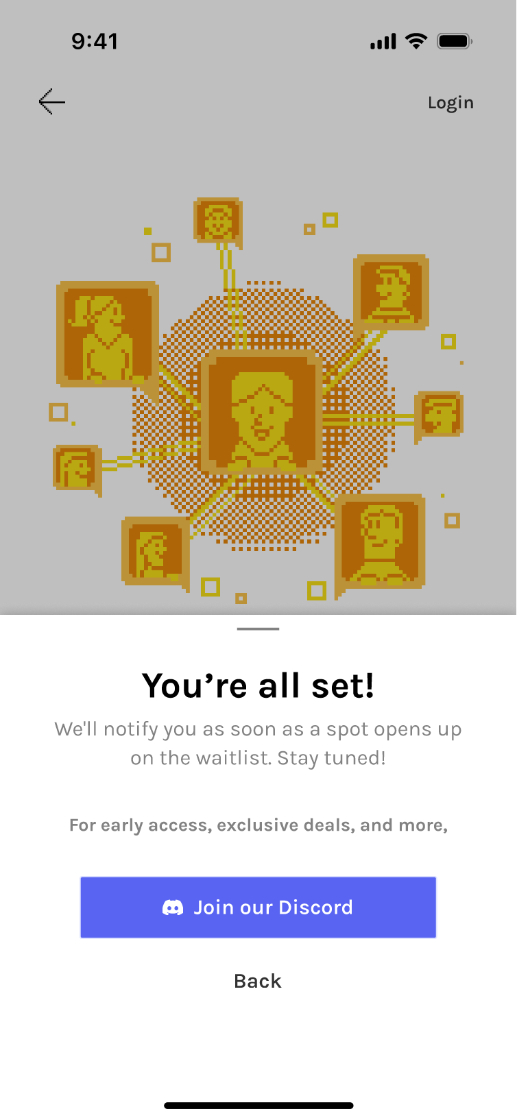
📩 Invite‑Only Variant (Public Test Phase)
Before open public launch, Bytey are currently using an Invite Gate to control test cohorts, monitor onboarding metrics, and maintain community quality.
Interface & flow
- Invite gate: Enter code → go through, or Join Waitlist path.
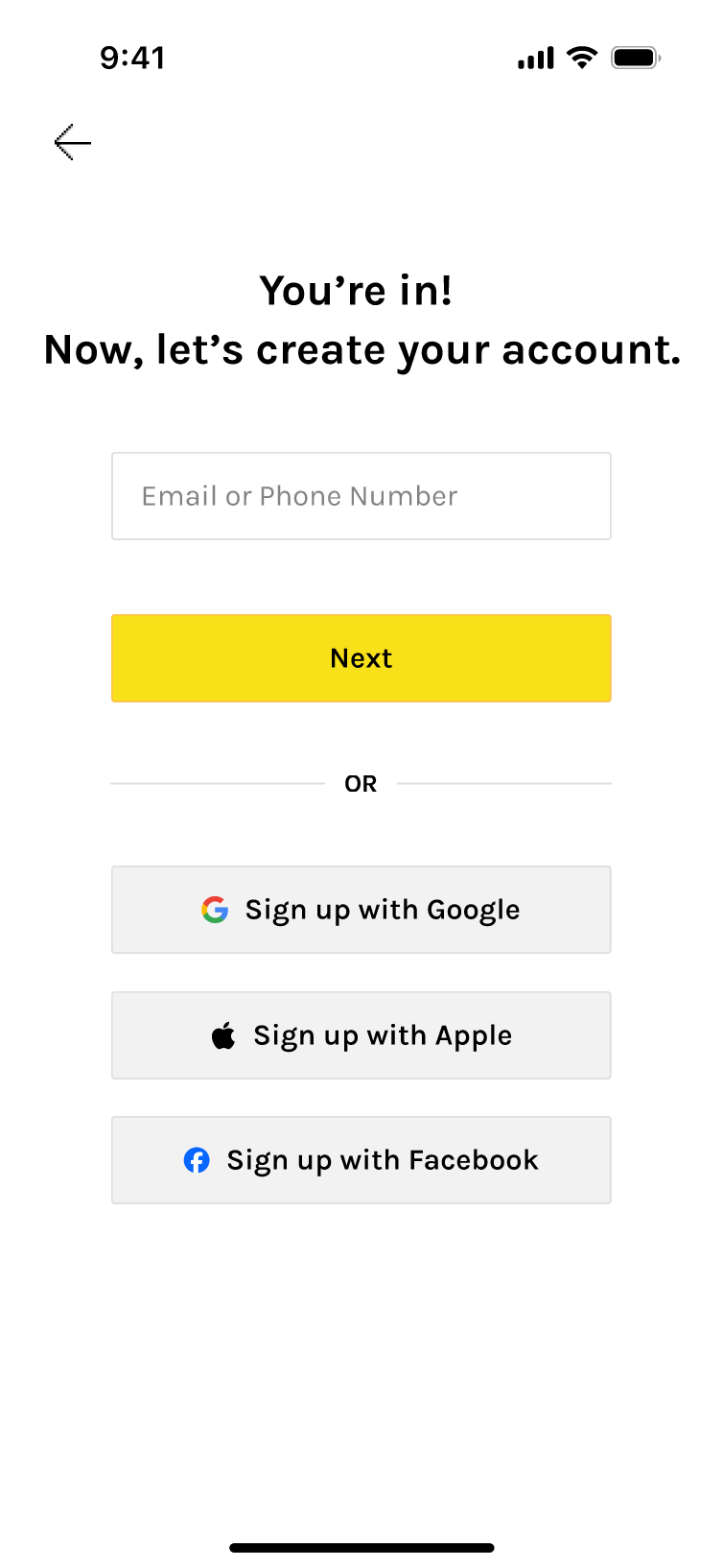
- Account setup immediately after the gate via OTP (code to email/phone).
- Taste Tags flow next (same 3 screens).
- Avatar still progressive post‑entry.
- Branded illustrations + light animation to convey warmth and core features; clear dual CTA states (have a code / need a code).
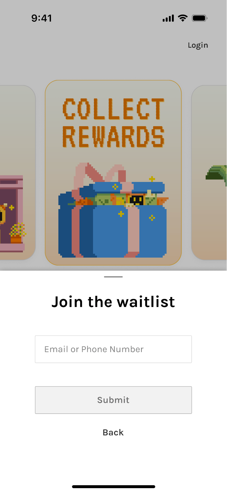
Variants tested: different animations, speeds, and code input affordances.
Accessibility: numeric keypad on mobile, obvious error/empty states, clear waitlist confirmation feedback.
🍽 Taste Tag System Iterations
Taste Tags are not just onboarding UI. They are core product infrastructure. As the product designer, I worked closely with engineers to shape the taxonomy behind the system, bridging user behavior and system architecture.
🔑 Influences

Search relevance and restaurant/food discovery (core)

Data organization and cleansing (foundation)

Recommendation ranking

Community content (posts and feed relevance)

Gamified task and card system
🚫 Key constraints
- Dataset limitations: Early database does not contain every cuisine, dish, or restaurant type.
- Tags must prioritize what exists today while preparing for future expansion as new cuisines, dishes, and restaurants are added.
🏁 Goal
- A structure that is clear for users and usable by algorithms.
🤔 Design considerations

User cognition
How people actually think about food.

Product needs
Fast onboarding and strong personalization.

Technical constraints
Data schema, embeddings, and ranking logic.
v1/ Regional (1-3) → Flavor (≥1 or Skippable) → Diet (opt)
This early version established the initial Taste Tag structure using the first dataset, focused on the most common cuisines around the testing area.
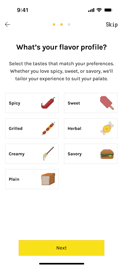
✅ What Went Well
- Worked with the initial dataset, focusing on popular cuisines in the testing area to set a clear baseline for early testing.
‼ What Went Wrong
- Flavor step may be unclear for some users with low selection confidence as,
- Flavor preferences change frequently.
- Flavor perception is subjective.
- Hard to structure in data and many dishes are customizable.
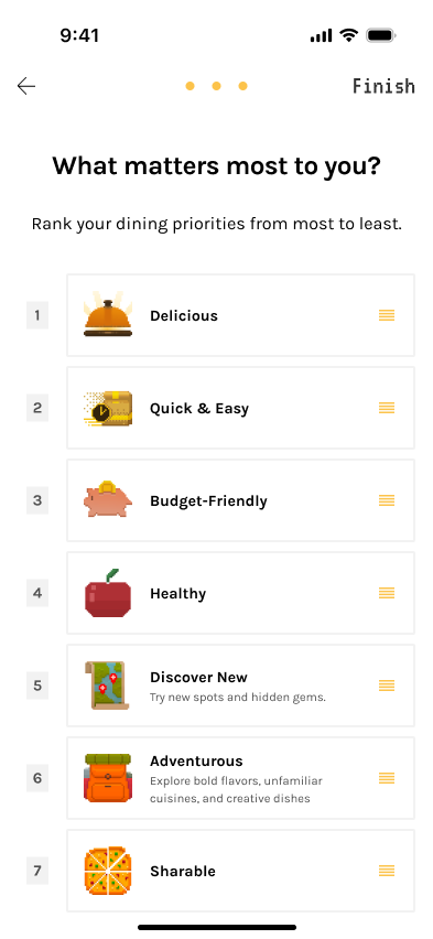
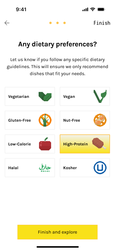
v2/ Regional (1-3) → Diet (opt) → Priority (ranking)
Flavor was replaced with a ranked Priority step, as ordering priorities proved to be a clearer and more actionable signal than flavor.
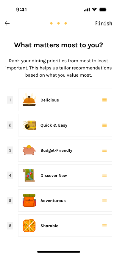
✅ What Went Well
- Priority reflects real ordering behavior.
‼ What Went Wrong
- Diet taxonomy needed refinement due to data constraints and potential AI hallucination.
- Some diet types (e.g., vegan) were well labeled in restaurant data, while others (religious diets) were inconsistent.
- Religious diet labels carried higher risk due to less reliable menu data and AI hallucination
- Diet restrictions and preference-based goals were still mixed together, making the category less clear and less aligned with user expectations.
v3/ Regional (1-3) → Diet (opt) → Eating Style (opt) → Priority (ranking)
Separated Diet from Eating Style to keep Diet focused on dietary restrictions, while moving preference-based goals like Low-calorie and High-protein into Eating Style and combining some flavor ideas with food types there.
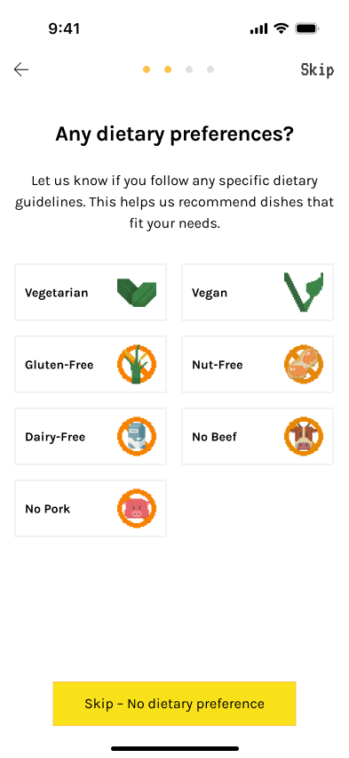
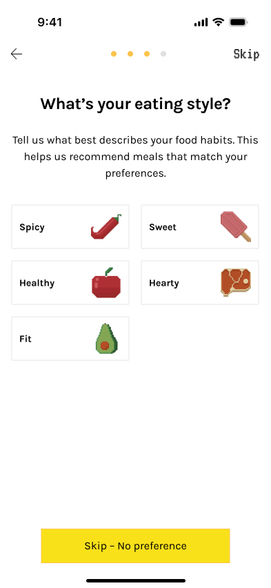
✅ What Went Well
- Clearer system logic and better match with user expectations.
‼ What Went Wrong
- 4 screens felt long and added onboarding complexity.
- Richer taxonomy, but limited payoff relative to the time required.
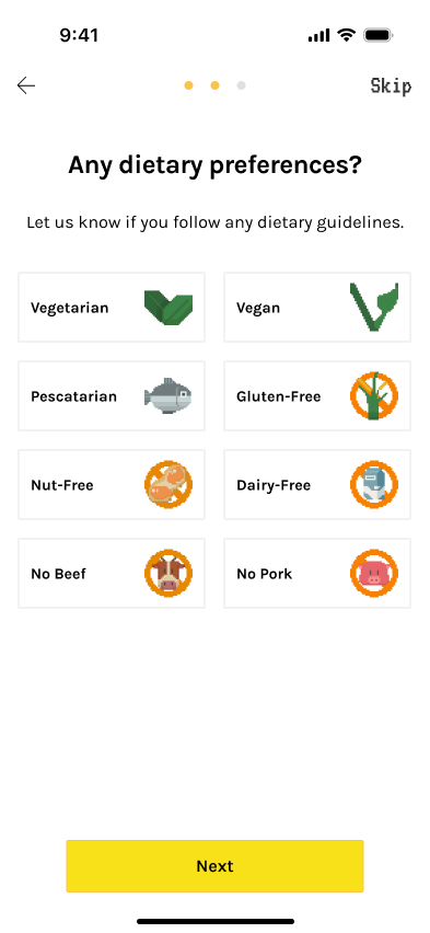
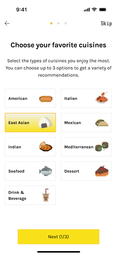
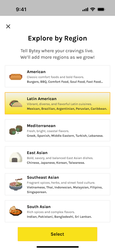
Final/ Updated Cuisine (required) → Diet (opt) → Priority (ranking)
Main changes: updated Cuisine and removed Eating Style. More Diet and Priority to accomodate user needs
The final version uses a more organic structure—Popular Picks + a general Regional sheet—to keep onboarding short while leaving room to scale cuisine organization over time.
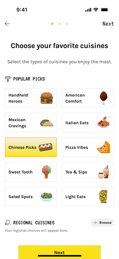
✅ What Went Well
- More flexible and organic than a fully fixed cuisine taxonomy.
- Better fit for current data coverage and onboarding speed.
- Easier to expand later with broader regional models or more detailed subcategories*.
📊 Indicative metrics
Median completion time
< 35s
Abandon
< 5%
“Not sure what to pick”
↓ to ~12–15%